2017
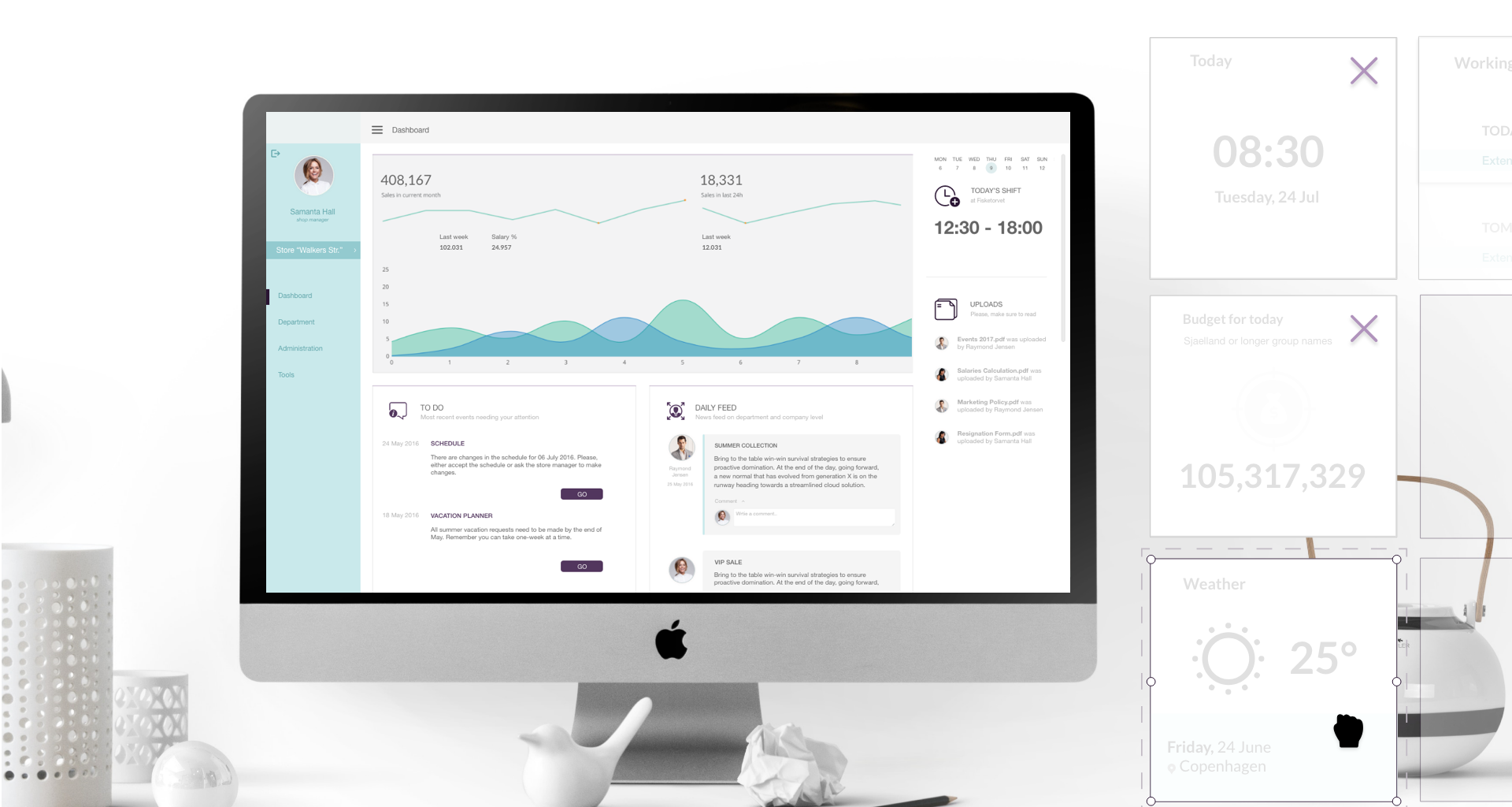
Dashboard
Case Study
SameSystem offers an online workforce management solution for retail business - from creating and handling of work schedules, overview of salaries and contracts, to statistics for turnovers, budgets with additional integrations with other softwares and much much more.
Following is the approach used during my work process on solving a challenge for one of my employers, showed in as many (or little) details as considered appropriate for not violating their right to keep specifics for the well-being of the company. I joined SameSystem (2014-2018) as a designer for their digital solution, and worked with concepts and design implementation of features for both their mobile and web products.
* Due to NDA this work is minimally captured. Also some designs show concepts in their work stage, where differences in the final implementation may present.
Overview
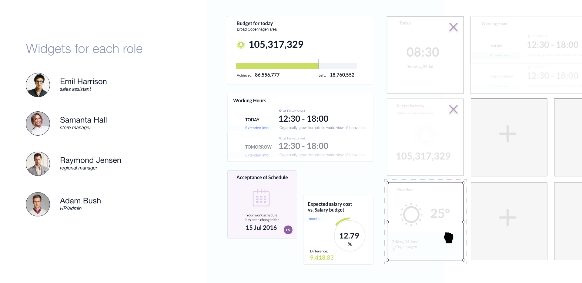
A widget based dashboard for the system had two great benefits. First, quick overview of KPI's store and area managers are operating with on a daily basis. Second, ability to select relevant content also any position, from sales assistant to business owners.
Problem Statement
Provide Store and District managers with a summarised overview of their store(s) performance and factors influencing it.
Target Audience
Target audience for this feature was primary existing clients of the company - medium and large sized retail businesses, and more specifically their Store and District managers; additional audience - Sales assistants.
Roles and Responsibilities
My role was to cover all design aspects for bringing the feature to life. We were a team of an in-house project manager and development team located in Europe. My responsibilities were to develop a concept, research the types of widgets, create the layout and set design standards, define the interactions, create low and high fidelity mockups, collaborate with PM and developers for the implementation.
Scope and Constraints
At first, there was no timeline for the feature - the main goal was to explore the possibilities and gain a better understanding on how to provide a welcoming overview of store performance indicators.
Once the concept for a dashboard was approved, the feature was planned to be delivered within two months time frame with a potential for future updates and improvements. This defined the scope being usage of only existing calculations and parameters (without introducing new ones to the development team) for the first version.
Contribution
Define primary and secondary persona.
Research KPI’ of a top interest for the target audience.
Explore navigation patterns and map the user journey.
Low and high fidelity prototypes for PoC.
Widgets visualisation, layout and states.
Outcome
A welcoming landing page for the platform showing a widget based dashboard consolidating different layout for Store managers, District managers, Sales assistants and administrators.
The process
All widgets were designed with future scalability in mind. Layouts in proportions of 1:1, 1:2, and 2:1 were developed to ensure flexibility for rearranging and selecting widgets in future updates. This approach allows for seamless customization and adaptability, supporting the dynamic needs of users while ensuring compatibility with anticipated interface enhancements.
1. Understanding the problem
Who are the users and what problems are they facing?
How does the project align with the brand mission & goals?
To evaluate what content may be of an interest for the new landing page of the platform, we relied on the input of existing clients (medium and large sized retail businesses) in conjunction with features usage analytics. The Store managers and District managers of retail chains, needed a quick overview of the KPI’s of a store and/or chain of stores to measure performance. To understand how many of these indicators are needed and how frequently, we checked the usage of the corresponding features against the size of business and user role. This combination (of both qualitative and quantitative approach) gave deep understanding of the needs to be solved. Even though users were able to find the numbers and statistics they needed, there was no hub spot providing a summarised overview. Discussions with Store and District managers revealed more details about why these KPI’s are the ones they needed a frequent access to, and also elaborated on additional good-to-have features.
At the time I joined the company, the platform was already providing sets of features for operating with budgets, salaries, work schedules, statistics and more. However, a welcoming landing page was never a top priority - the people from the industry were more interested in what they can do with the platform and how it solves their specific challenges, rather than what page loads first (they could easily navigate to their daily needs from the menu, and were not greatly worried about it).
Being a leader in delivering workforce management solution for retail chains in Denmark, with a strategy for expanding around Europe, the company started to give a higher priority to the ease-of-use and digital trends to establish their online presence.
2. The challenge
How might we provide a welcoming landing page for the platform which brings value to existing clients and is appealing to new potential ones?
Assumption: A Dashboard, showing key performance indicators Store and District managers operate with on a daily basis, would provide the needed summary for quick stats right after they log in. Besides, it will serve as a hub spot for accessing top used features.
3. Research and content requirements
The characteristics and details of a Store or District Manager role can vary between different companies, organisations and brands, but within a retail context, the two positions summarise close to the following:
“ A Store manager
is responsible for every aspect of the day-to-day supervision of retail outlets, including sales, staff, stock and resources management. A retail manager’s role is to run a store successfully. Working on the shop floor, they are in constant contact with their customers and staff. They are responsible for ensuring their staff give great customer service as well as monitoring the financial performance of the store.”
“ A District Manager
oversees a region or cluster of stores within the organisation and reports to senior management. Primarily in charge of the operational practices; including ensuring each location runs well, is in compliance with company standards, is properly executing marketing campaigns and visual merchandising plans, and meets budgets and sales goals. The District Manager is also responsible for hiring and assessing performance of store managers, creating and maintaining budgets.”
Both positions are operating with budgets, turnovers and performance, but on different levels, and are therefore having the need to follow with performance throughout the day. For both, the time they had to get acquainted with this overview was limited - a store manager is needed full-time on the floor, and a district manager is spending a good amount of time travelling and also needs to keep an eye on not one, but several stores/locations.
Besides, these two roles were not the only ones using the platform. A regular sales assistant would also have access to it in order to see their work-schedule, upcoming shifts and ongoing changes.
So, despite the main focus being providing Store and District managers with KPI updates, there was also need to consider what a Sales Assistant would see and experience when they log in on the platform.
4. Content needs
Store Manager - daily sales target for the store and turnover, monthly turnover and budgets, announcements from head quarters.
District Manager - monthly turnover/budget ratio, salaries budget, store performance by group.
Sales Assistant - daily sales target, upcoming shifts, available(free) shifts, changes in own work schedule, announcements.
5. Analysis
A Store Manager would go through few clicks to see the daily turnover vs budget for a store. In case they would like to see how the today’s performance is compared to the previous day, or the same weekday from another month, or the same date of another month, they would dive into loading a few more screens via a number of additional clicks. They would do this every time they needed an overview for the performance.
When it comes to the steps a Sales Assistant needed to go through for seeing their schedule or changes in it things were a little bit different. Most cases they would just look at the printed work schedule or wait till they receive an email for a specific change to dive in the system (these insights along with additional research were used as well for defining the values and needs for a mobile app).
6. Design
Before jumping into design, it was important to define success - given the time constraints for having the feature online, we have decided to aim for MVP and create one dashboard layout per role.
I began by defining a grid for the most used screen resolutions by our users - we had this statistics available. Next, I start sketching roughly how each KPI parameter could look. This allowed us to see not only what visualisation method would be most convenient for each case, but also to group similar types. Each group type became a widget - aiming for a consistent design and allowing quick access to manual adjustment of several parameters if needed. Having a draft visual of the widgets gave as well a glimpse over what proportions and size would make sense for each single widget and the data it was showing. As a next step, the widgets for each role were separated into layouts named after the roles. We had an idea that we may hit a problem with blank spaces in the final layout or that some widgets may need to be redesigned, but it was difficult to know how much and into what direction before having the full picture of how the viewer would see a full dashboard.
The challenge was that some users would prefer to look only at a number, while others were willing to see more explicit data. At the same time, on some layouts there was space to show a widget horizontal, where on others it needed to be show vertical to avoid having gaps in the grid. So, I dedicated a little bit more time to design a few proportions and sizes for each widget to make the choice available. This approach was meant to set as well the ground for a library of widget sizes and give the base for further update of the future where the users would be able to mix and match the widgets for their dashboard.
An interesting point we have faced during the development was the uniqueness of permission settings each of the existing clients had. Based on their internal rules and regulations it could happen that some widgets information should not be displayed to a specific account or a sub-role. This required creating a separate state for each widget (different from the empty state) when the user account was not allowed access to some data.